As part of my visual design certificate with the UX Design Institute, I completed a design project that involved creating the UI for a new cutting-edge banking application. The project phases included mood-boarding, design exploration, multiple design iterations, and the eventual delivery of three different pages of the app for multiple screen sizes.
Creating Mood Boards
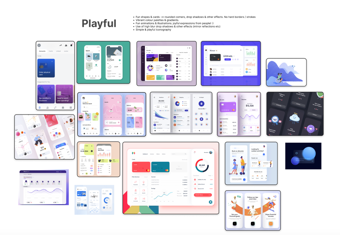
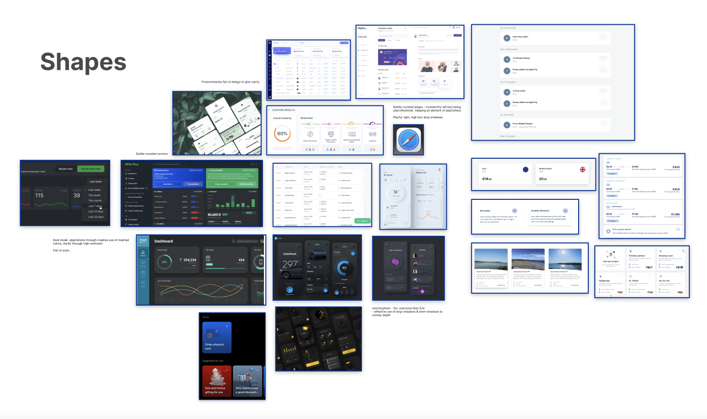
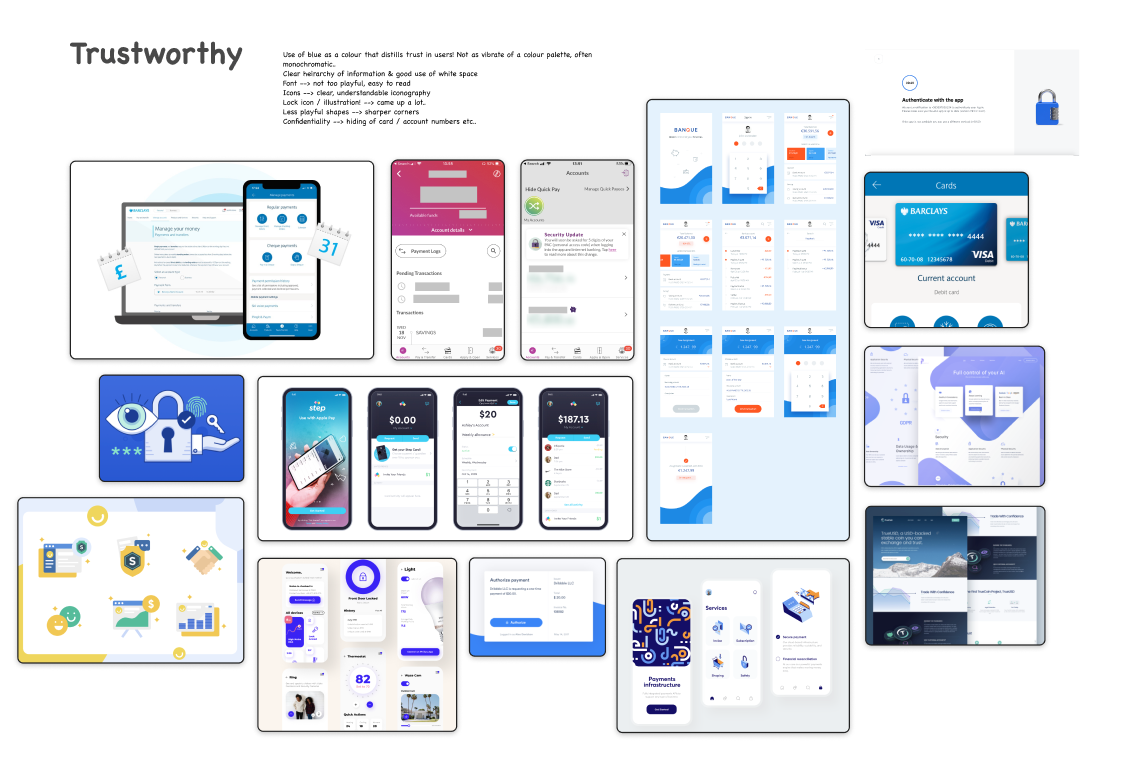
The primary brand values were given to us upfront at the beginning of the project. They were 'clear', playful' and 'trustworthy'. The project's first phase was to create visual mood boards for these different brand values. These mood boards would then serve as sources of inspiration when exploring different design styles & compositions later. I gathered selections of inspiration from various online sources. These included Dribbble, Pinterest, Behance and UI designs I came across on other sites. Designs (or elements of them) that I felt encompassed these brand values were captured and added to the relevant mood board. Eventually, they began to take shape.
I also created mood boards that would appropriately fit the brand values for other components of Visual Design. These included Colour, Typography, Iconography and Visual Design Styles/Components.
Design Exploration
Once the mood boards were complete, it was time to move on. The jumping-off point for the design work was the super low-fi wireframes for the app that we received. We were to bring them to life. The first step was to explore and experiment with different design styles that matched the brand values. This involved a lot of rough design work on visual styles and design patterns/components. I emphasised trying to generate a range of unique ideas, somewhat disregarding quality during this phase. The mood boards came in handy during this phase. It was primarily about exploration & generating ideas, refining the details could come later. A pretty obnoxious Figma file began to take shape quickly!
Here are a few early ideas that I generated. These pretty ugly designs were subsequently iterated on and proved to be influential in creating the final designs:


I always considered responsiveness & accessibility when exploring different design styles/patterns. Are the colour contrasts accessible? Will a component be scalable to smaller screen widths? Every style and component that I created had these considerations thoroughly thought out.
As the project progressed, so did my visual design knowledge. I continuously learned new design methodologies and techniques through the course's online lectures & webinars. It covered design best practices for typography, colour, iconography, design layouts, responsiveness and much more. I was able to incorporate these new learnings into my design work seamlessly.
As I progressed through iterations of the designs, I sought feedback frequently from UXDI mentors and other course students. The intention was to validate ideas and identify areas for further exploration. Getting other people's opinions was invaluable. Being thick-skinned and receptive to people's honest feedback is essential to being an effective designer. Their feedback was crucial in helping me refine my designs. One bit of received feedback was that the colours in one version of my designs were too muted. They didn't fit with the playful brand value:

I definitely agreed, and now about 2 years later, even more so!. I went about increasing the saturation of colours in my palette as a result.
Creating a Component Library
I saw the project as an opportunity to practice my Figma technical skills and enhance my design workflow. So I created a styles/component library to simulate a scalable working design system. The library leveraged lots of advanced Figma techniques. These included variants, auto layout, interactive components and base components. I followed Atomic Design principles to create the library, including:
- Font, colour and general style (shadows, borders) definitions (Atoms)
- Design components - Buttons, Cards, Navigation elements etc. (Molecules)
- Design compositions for section & page templates (Organisms)
I kept the library frequently updated. Whenever I'd decide on a final design pattern, it'd get added to the library. I used Figma's variants functionality to define all the different styles, variations and states a component could take. Using base components, I set up specific components in a scalable 'single source of truth' manner. A component such as the 'button' had lots of variants. So setting it up with a nested base component made making bulk updates much easier.
A snapshot of the button component, with all possible states & variants;

Final Designs
Eventually, after a lot of exploration, numerous iterations and much refinement, I landed on a final set of design styles & compositions. They were visually appealing, fulfilled the brand values and were appropriately responsive & accessible. I then went about creating the final designs.
A few quick notes on the designs:
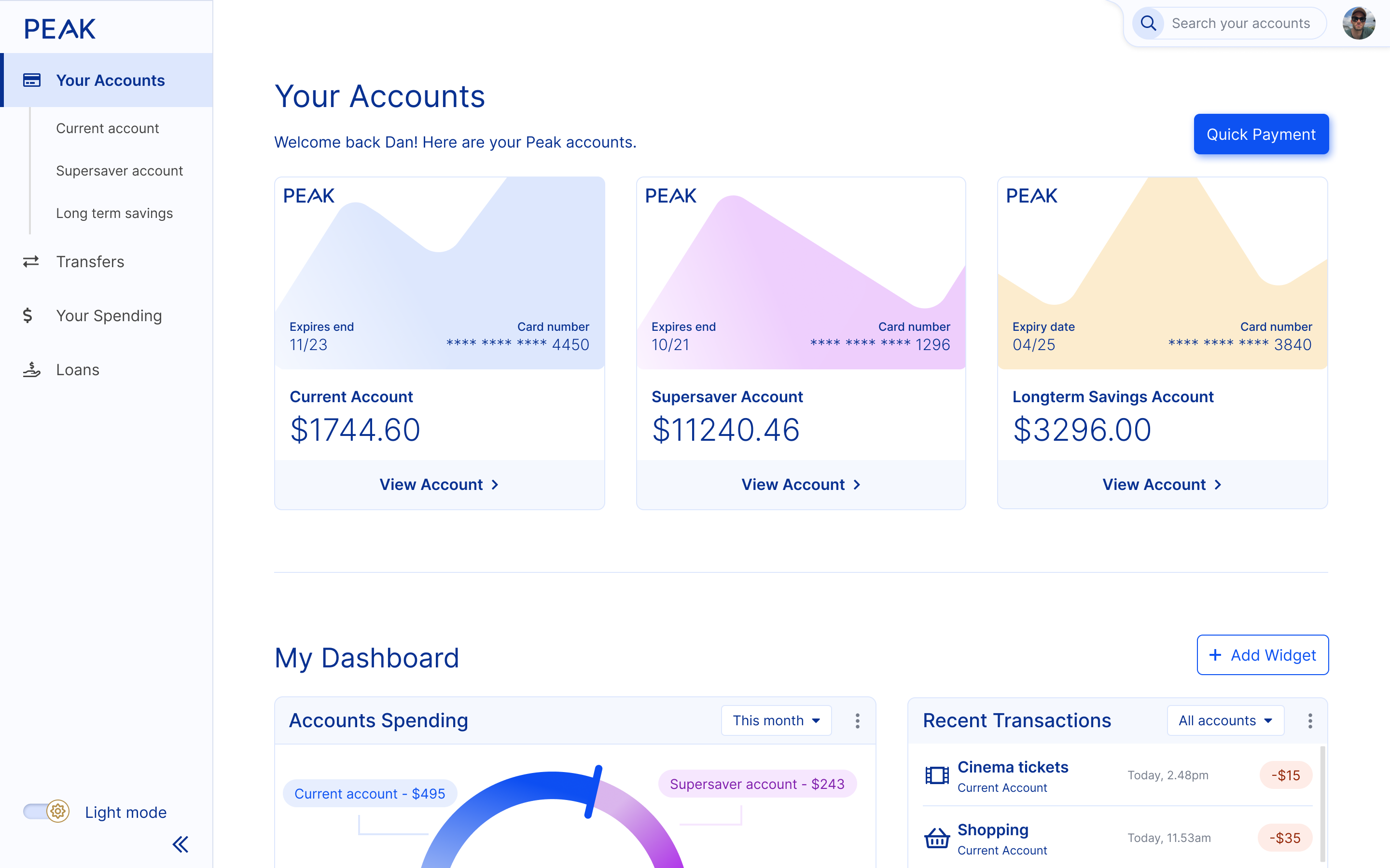
- I chose Inter as the app's typeface. Inter is a flexible, variable UI font that was less overused at the time of project completion!
- I created a minimal typography scale that limited the number of font sizes on the UI.
- I built a playful colour palette with multiple tints for primary, secondary and accent colours. I also included a greyscale palette.
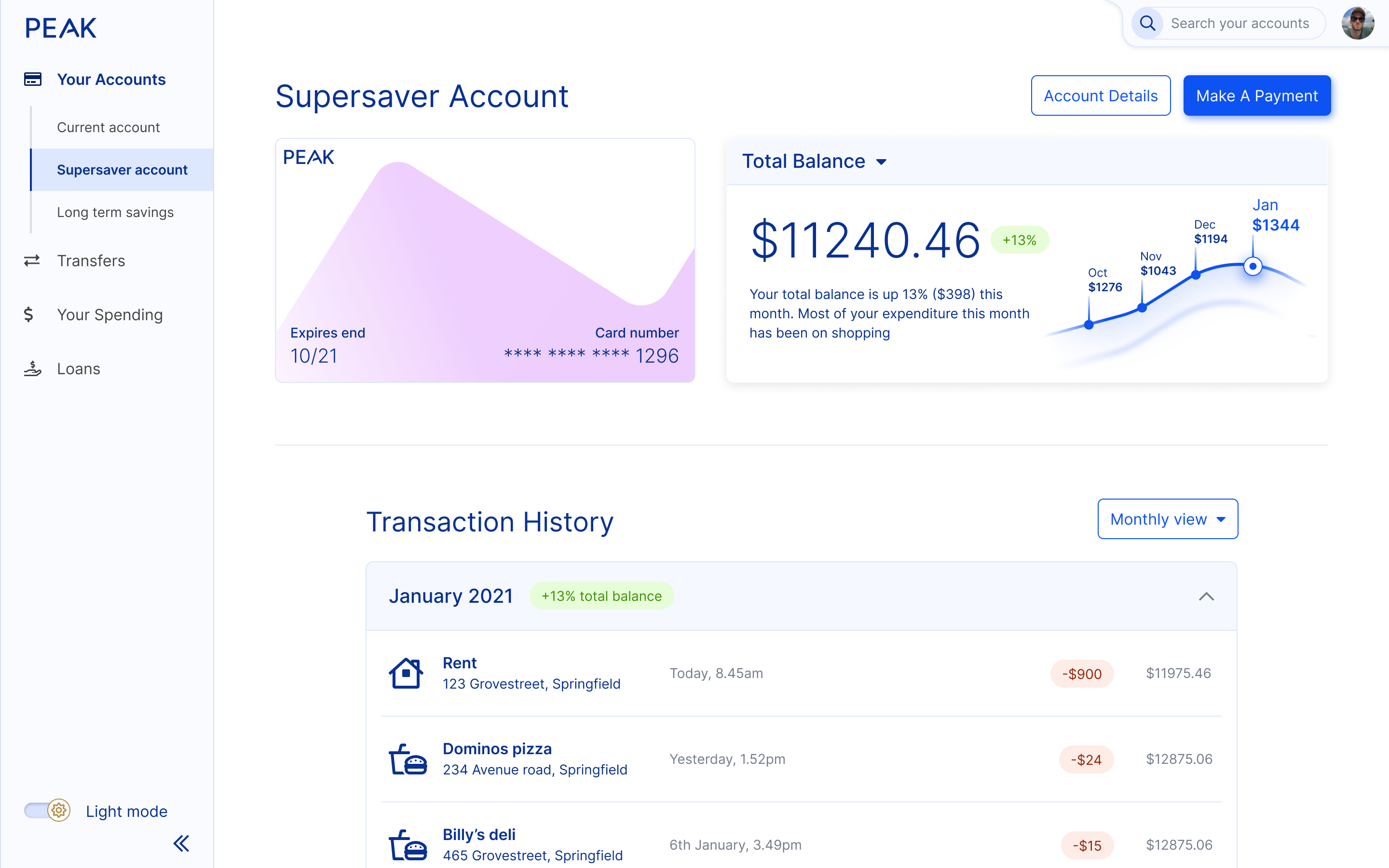
- I used an 12 column grid to design the desktop screens, 8 columns for tablet, and 4 columns for mobile. This was used in combination with an 8pt spacing system that was utilised across all the designs, ensuring a clean and consistent layout.
- I designed many creative and innovative UI components using these colour and font definitions.
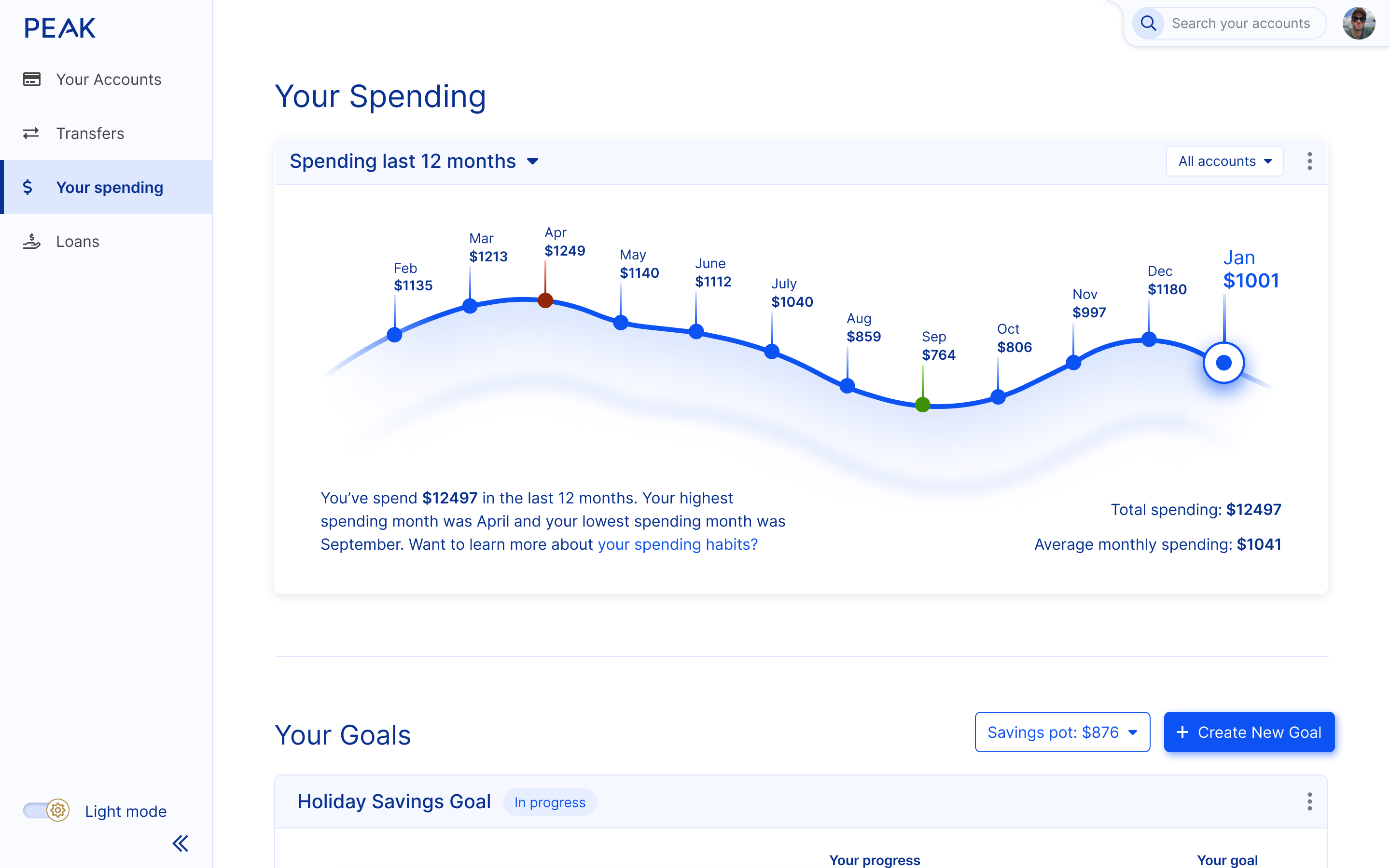
- I used appealing visualisations to creatively illustrate the user's spending & saving trends.
Here are the final deskop screens for the project:
Prototypes
Here's a few videos of the prototypes across across the 3 different screen sizes.