I always liked the idea of creating my own personal site from start to finish, from the research and design phases all the way through to developing it. I figured it'd be an excellent opportunity to work on both my design and front-end development skills. I had talked about creating a personal site for a while, but I wanted to improve my front-end development skills to a point where I could build it myself instead of using a standard site builder. I wanted it to be unique to me and for it to feel like it was actually my creation. I got there eventually! Here's a walkthrough of the project and the different stages in the process.
Portfolio Research
What do product designers' sites look like? At the start, I'll be honest, I didn't really know! So that was my first step - checking out many other designers' online sites/portfolios to get inspiration and see how they structure their content and style their sites. There are so many damn good designers out there. It wasn't hard to find inspiration. Online lists like this one from Brian Lovin were helpful, as was clicking on people's site URL's from Twitter! I'd soon built a pretty good mental model of what a designer's personal site looks like and the content they generally included.
Information Architecture
I had to figure out what content and the site would have. I knew I'd obviously want to showcase some of my design work, but I also thought the site would be an opportunity to tell a bit more about myself outside of design. I'd also talked about writing some design-related articles for a while, so I thought the site could be a place to show some of that. I also wanted to have a way to allow people to get in touch with me, be it through social channels or through a contact form. These were all things that frequently popped up on other designers' sites.
Once I knew what content I wanted on the site, I figured out how it would all work together from an Information Architecture perspective. There wouldn't be much content on the site to begin with. I decided to break it into a homepage and 3 main sections - case studies, about me, and my design blog. This seemed to follow the pattern I had observed on other designers' sites.
Early Design Work
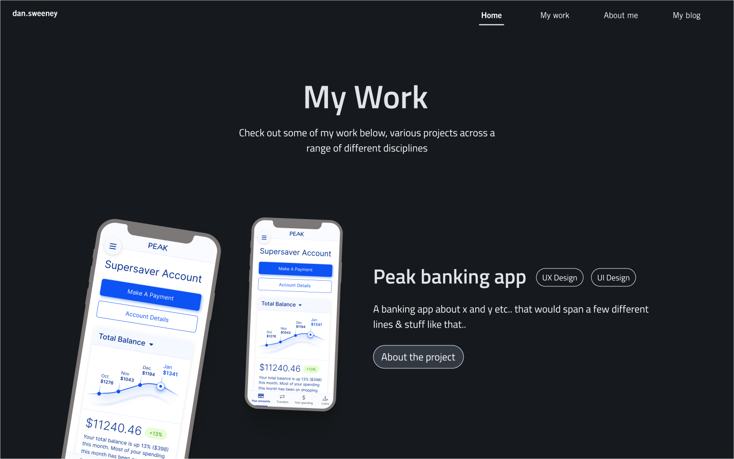
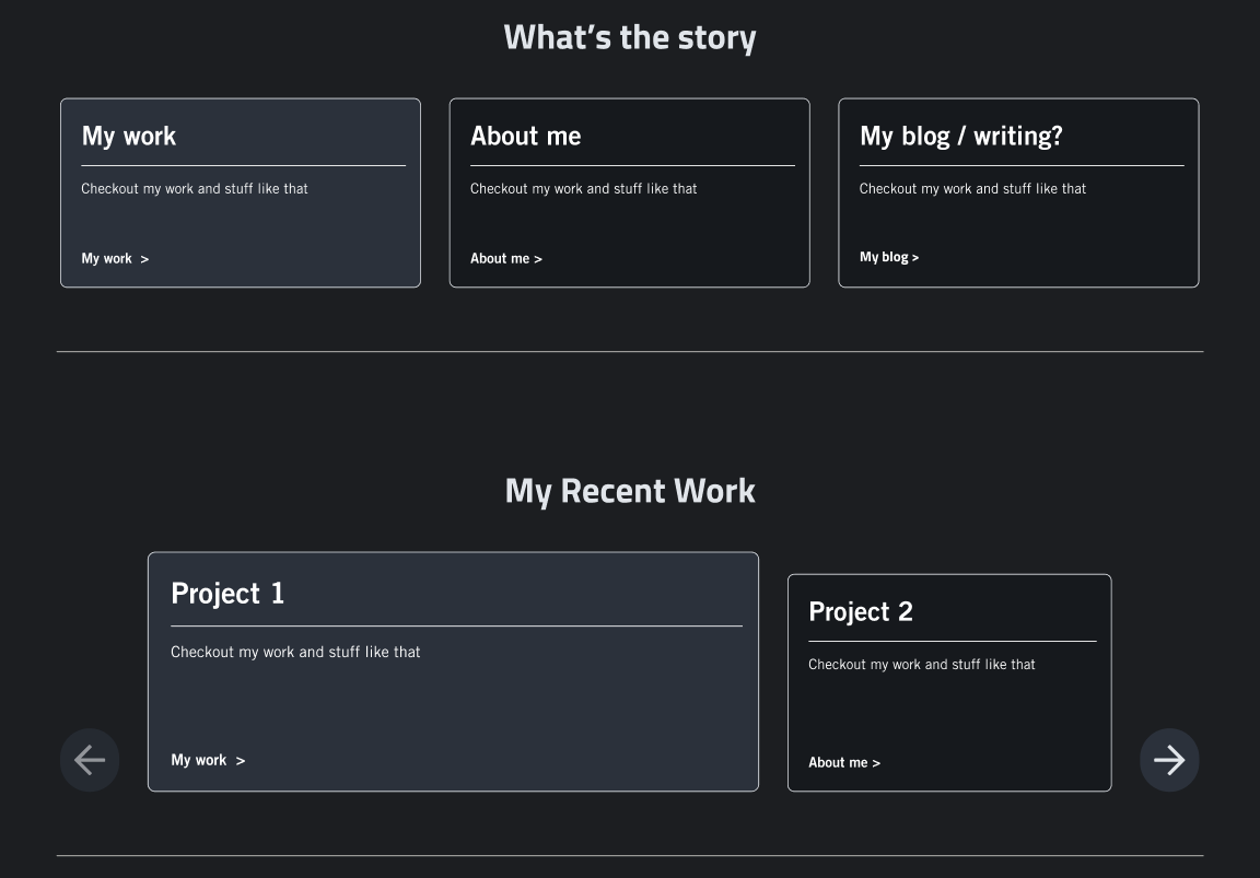
Having decided on some of the content for the site, I went about some super low fidelity design work to figure out how the site could work. This involved wireframing and experimenting with different site layouts and compositions. It also involved understanding visually what content I wanted to include on each page. This process was almost absent of any styling. It was really just to get a sense of how I could potentially display all the content that I wanted to and how it could be structured. One challenge I encountered was figuring out how much content I wanted on the homepage. Many designers keep it pretty minimal. I decided to follow that trend but perhaps put more content up front on the homepage than usual.
Some initial very low-fi wireframing;

Ideation and Iteration
Next, I started experimenting with some different visual styles for the site. From early on in the project, I had it in my head that I wanted to use a dark-themed style. I explored different colours, font families/styles, styling effects and animations. I also experimented with several different page compositions and layouts.
Early visual styles experimentation;


Final Designs and Styles
Eventually, after many iterations, I settled on a set of colours, a typography scale, a set of components, and other styles that I was happy to proceed with.
Color Palette
I went through several iterations on a colour palette, experimenting with different hues, saturations and brightnesses until I finally settled on a palette I was happy with. Seeing the colours in combination with each other and seeing them in the context of my design compositions were critical factors that helped me decide on the final palette. All colours were accessibility tested to ensure sufficient colour contrast based on the context of their use.
The final colour palette for the site; (Image)
Typography
After experimenting with different modern sans-serif web fonts, I decided on Titillium Web as the typeface for the site. I really liked its aesthetics, and I felt it was unique from other common UI fonts, some of which get overused, in my opinion. I then created a typography scale encompassing all the different typography sizes and styles that would be required on the site.
The final typography scale for the site;

Component Library
When I'd figured out some of the styles and components I wanted to use, I started creating a variants component library in Figma. It's an excellent way to maintain consistency and scalability as the site grows and also increases the speed of my design workflow as I continue to iterate on the site. It was also good practice for me to build a mini-design system from scratch while incorporating Figma variants and atomic design best practices.
A section of the Figma component library that was built for the project;

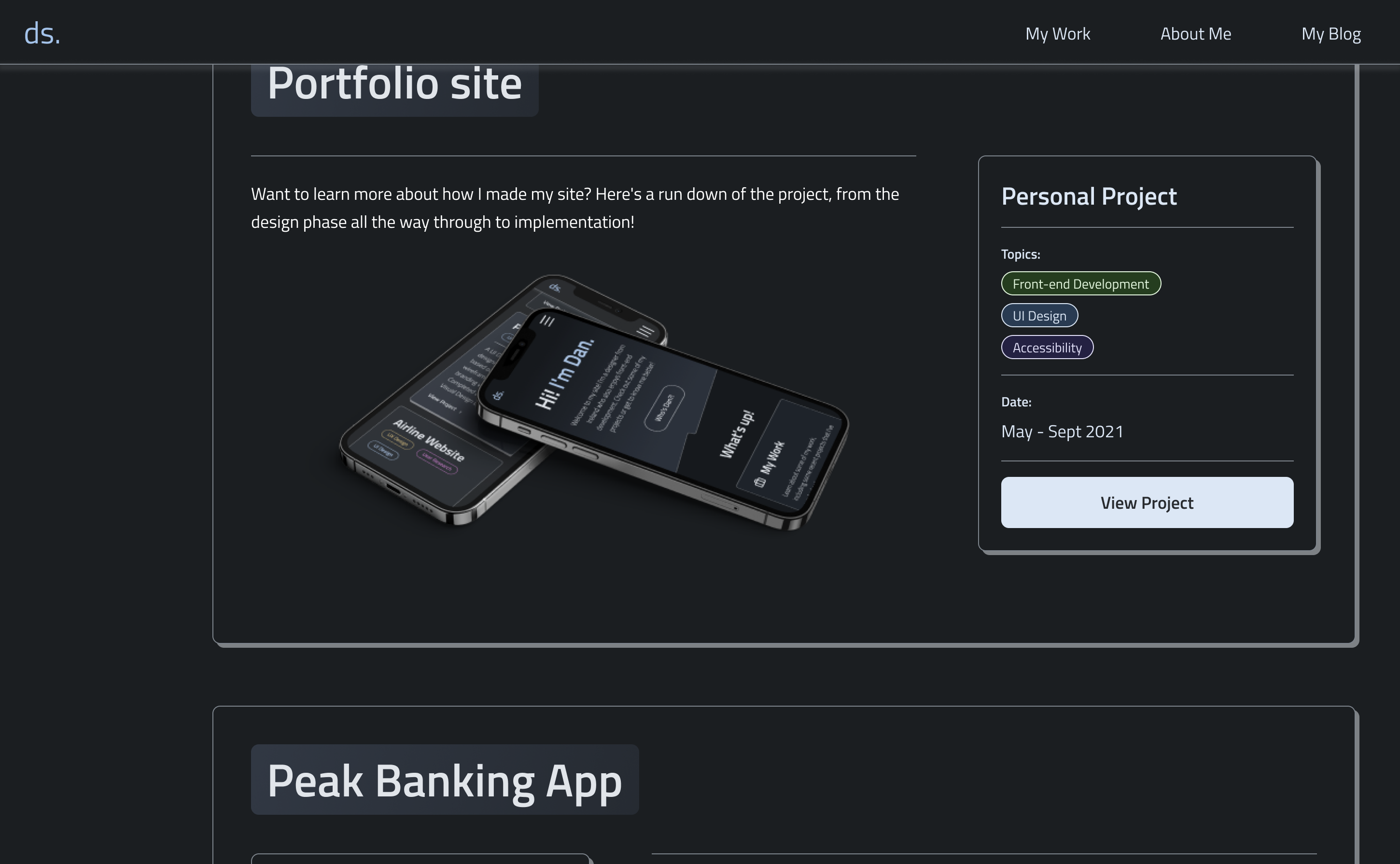
I eventually landed on the final designs when everything was in place. I knew the page content and compositions from my information architecture and design exploration work. I knew what the desired responsive behaviour was. As mentioned above, I also had the various design styles pretty well defined. However, there was still some tweaking of styles that I wasn't delighted with, followed by analysing how they fit holistically into the overall designs. I was constantly tinkering with things like shadow styles, border-radius values and font colours until the last minute.
Eventually, I arrived at that sweet spot where I had blended everything together and was satisfied with the result. There are always tweaks that you make along the way. I've iterated several times on the site design since the first go around. It now looks pretty different to the first set of final designs.
Implementation
Once I'd settled on the final styles, design components and screens for the site, I started building the site. I decided to use Gatsby as the front-end framework for the site, as I had some previous experience with Gatsby, and I'm familiar with React. I created a GitHub repo and integrated it with Gatsby Cloud to host and deploy the site. From there, it was just about developing the site using the Javascript/React and CSS/SCSS knowledge I'd picked up over the years. This involved building scalable, modular components aligned with those in my Figma component library. They could then be used across the site on different pages and in various contexts.
For the site's content, I decided to go with Contentful CMS. I created content models with content and metadata fields for case studies and blog posts. Using the Contentful API allowed me to pull content into Gatsby's GraphQL data layer and access it to build page content. I also used Gatsby's CreatePages function to dynamically build the site's pages in a scalable and easily maintainable manner. Having the content set up this way reduces the friction in adding new pieces of content (case studies or blog posts) or modifying existing content. Any changes in published content in Contentful will automatically trigger a new site build & deployment. It's super simple.
There were some interesting challenges while developing the site, such as building the card/image carousel logic and the top navigation menu effects. It was also a fun challenge to create a reusable card component with multiple variants that could be used across different pages. The theme toggle design and implementation was another fun one - I wrote a bit about it. I also spent a lot of time refining small design/animation details that probably didn't quite justify the effort! I won't go into the finer implementation details right now, but I might write more about it in the future. In the meantime, if you're curious to know more about the process, feel free to reach out.
It's worth noting that I'll continue to be iterate on the site. I'll continue to add Case Studies as I complete them. I'm also always looking for ways to improve/optimise the design, implementation, performance and accessibility of the site, so it'll never be in a fully finished state!